Somos Gin
OBJECTIVE: Create branding for a fictional gin company, Somos Gin, that feels beautiful, distinct, bold, fun, but still maintains a level of sophistication.

Logomark
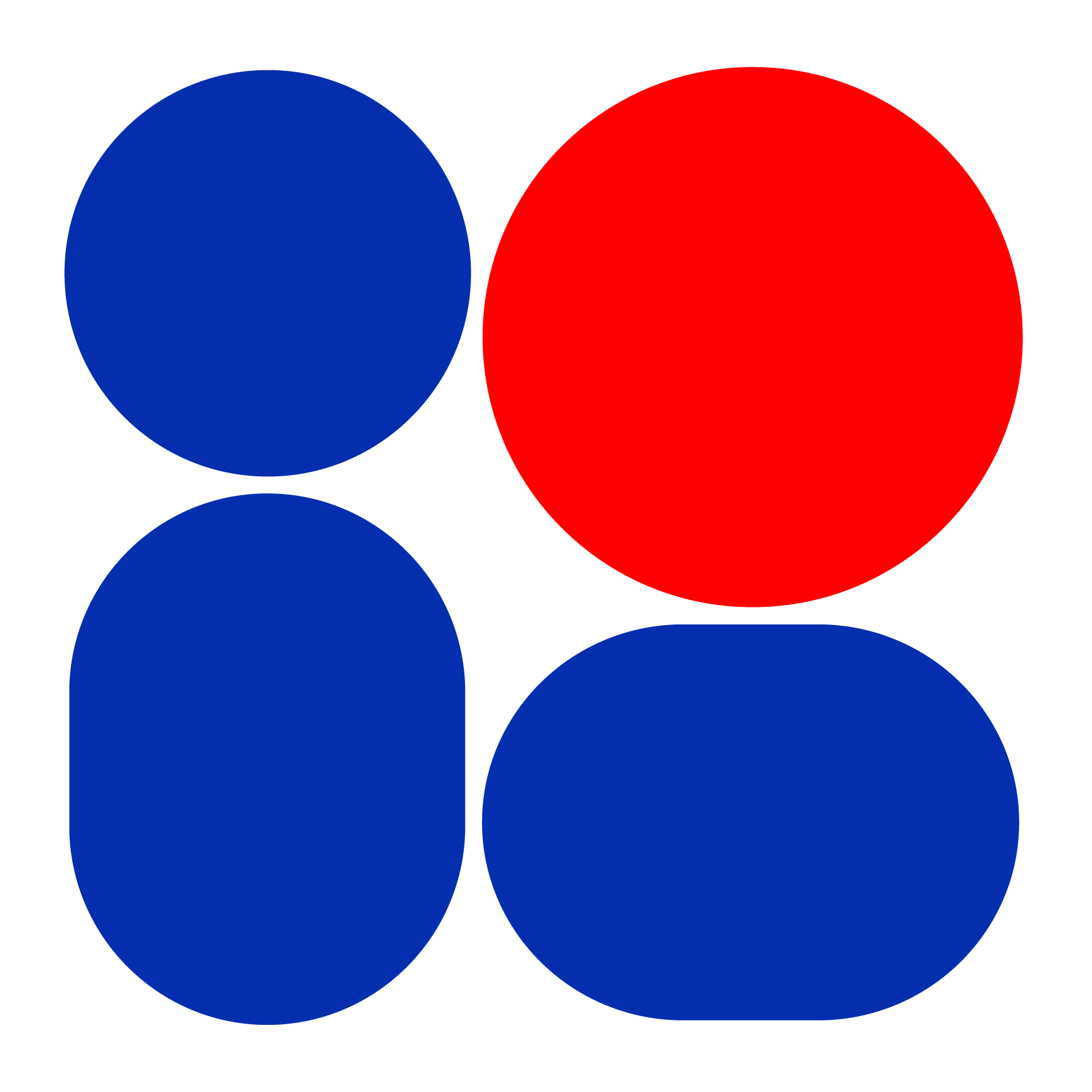
After starting with a simple sketch on a sticky note of an abstract “s” that utilized geometric forms and an angled modular grid, I shortly digitized, iterated, and refined the logomark until it reached its final version. The elaborate framing elements lean into a restrained yet maximalist aesthetic.

Naming
The name “Somos” was selected because it’s short, palindromic, and rolls off the tongue easily, but doesn’t contain any prior associations or connotations. Although in Spanish, it means “we are,” which I guess could be leveraged if I ever expanded this brand further.

Color Palette
In order to further develop the elegant and sophisticated tone of the brand, I selected a palette of mostly dark, rich reds and greens that easily flow together. These are utilized to create a subtle visual texture, and I selected a more vivid red to catch the eye.

Final Product
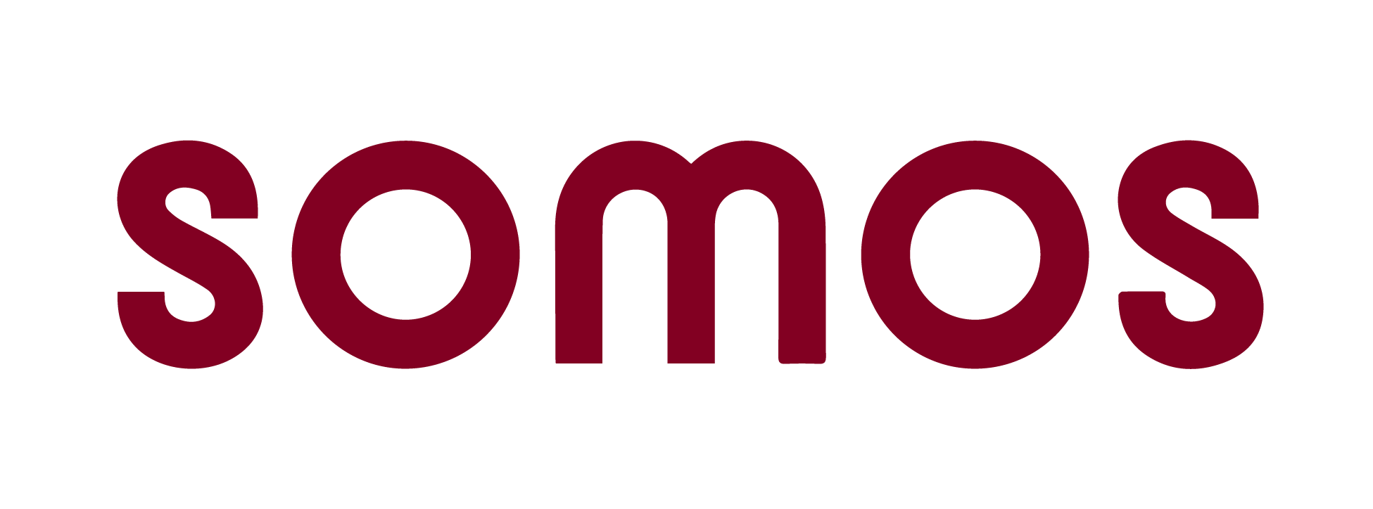
The full label consists of an extension of the design language of the frame, and the label on the neck of the bottle contains the wordmark, “Somos” in a simple, geometric sans serif in order to reinforce the bold and fun aesthetic of the brand.

